Trip Planner
After Austin-based RideScout and Portland-based GlobeSherpa began the process of merging to form moovel North America, the offices joined forces to help revamp the white label mobile ticketing app that had been developed by the Portland team and used by transit agencies around the country. One thing lacking in the existing app was a trip planning tool. The moovel team set out to make a clean, functional and user-friendly trip planner that could be utilized in a variety of settings and transit systems. My role in this project was UI design. I worked closely with product managers to help translate user testing feedback into design improvements.
Easy Integration
Trip Planner was designed to easily integrate into existing transit apps. The tool opens as an overlay on top of the app interface. It can be closed quickly to access other areas of the app and reopens in the spot the user left off. The screen on the right is an empty state shown on the first time user experience.
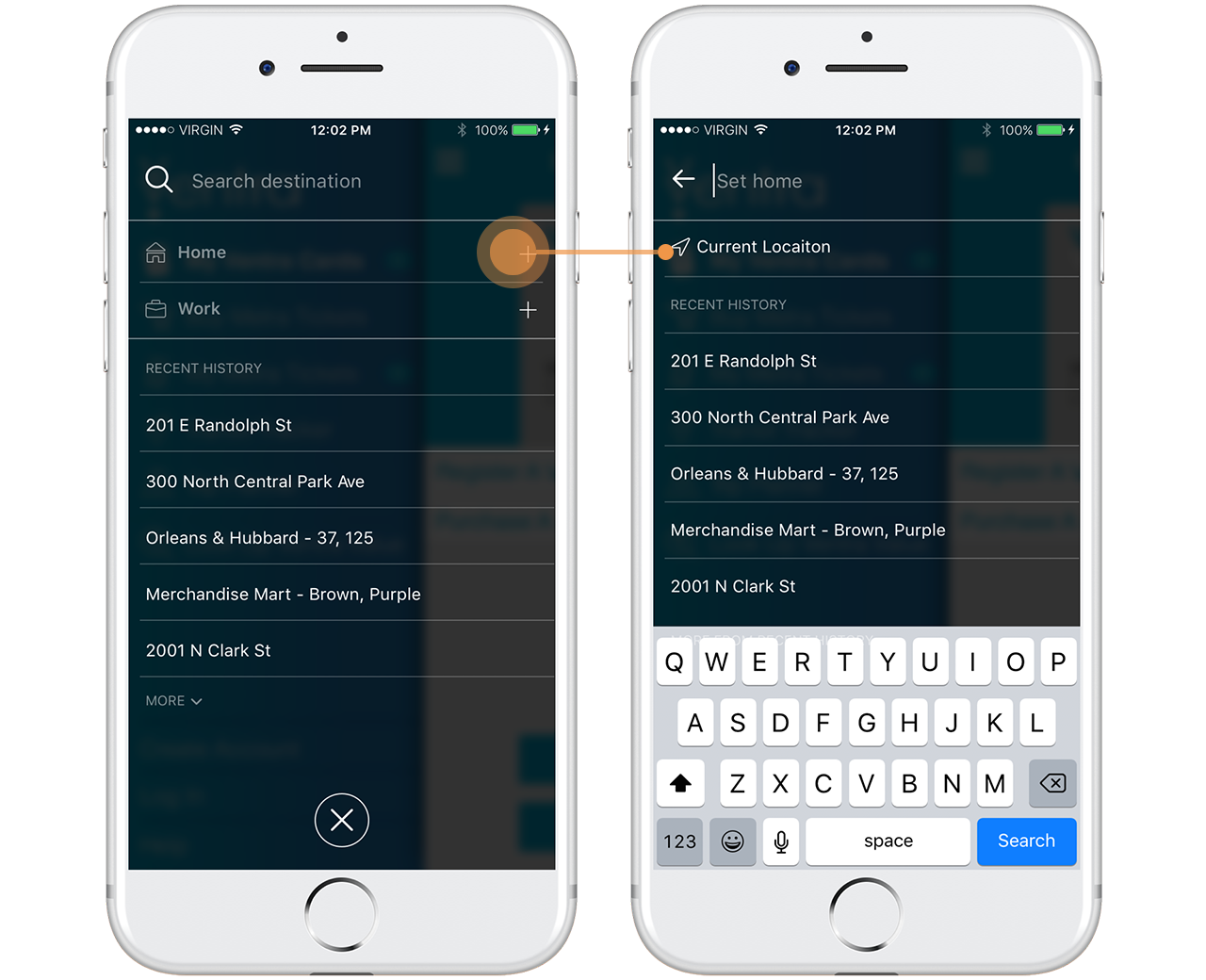
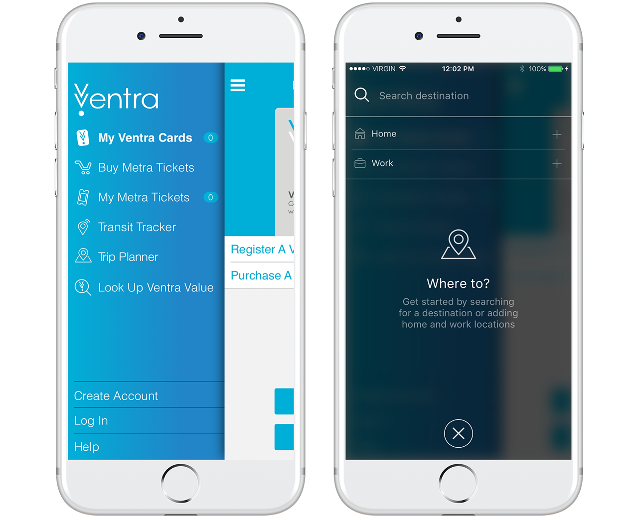
Home to Work and Back Again
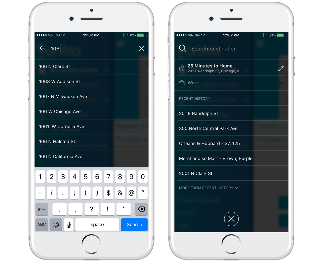
Since most people use public transportation to travel between home and work, we wanted users to be able to save those locations for easy access.
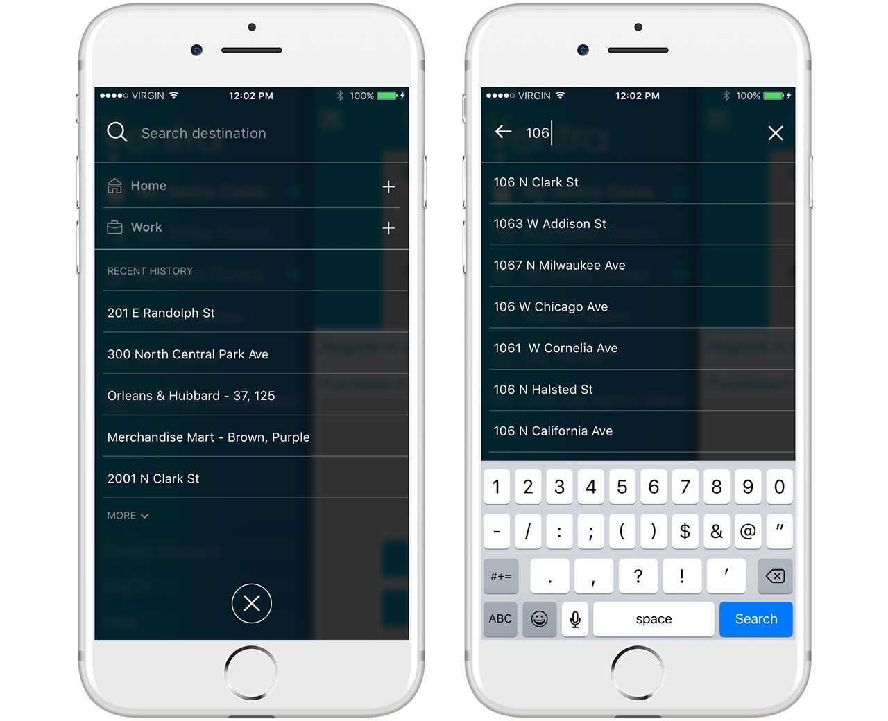
Quick Searching
Recently searched locations are remembered and displayed below the search bar when Trip Planner is opened. This allows the user to quickly pull up trip results.
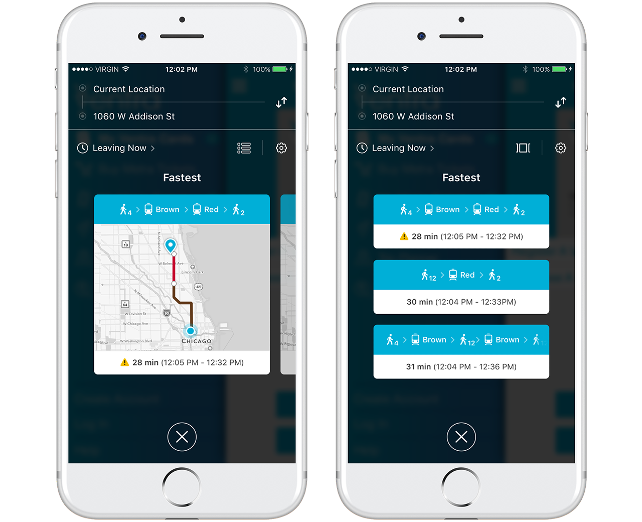
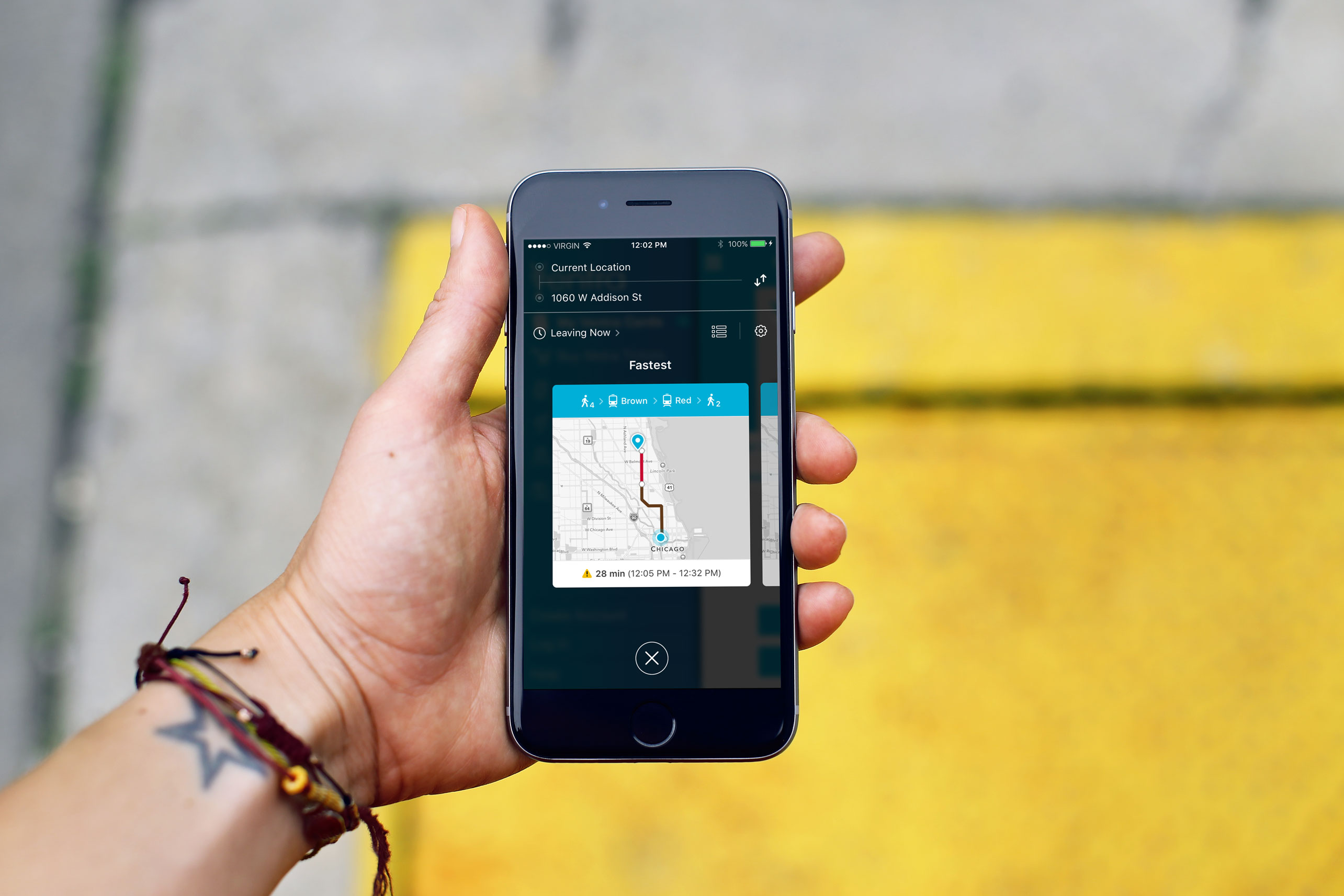
Trip Results
Once the user selects a destination, Trip Planner displays three route options in one of two ways - a swipeable card view or list view. The user can switch between views by tapping the list or card view icon to the left of the settings icon. This design is intentionally similar to RideTap so that the two could be integrated at some point in the future. The user's current location is assumed as the starting point, but can be edited. From this screen, the user can swipe through trip options and select their preferred route or access trip and time settings.
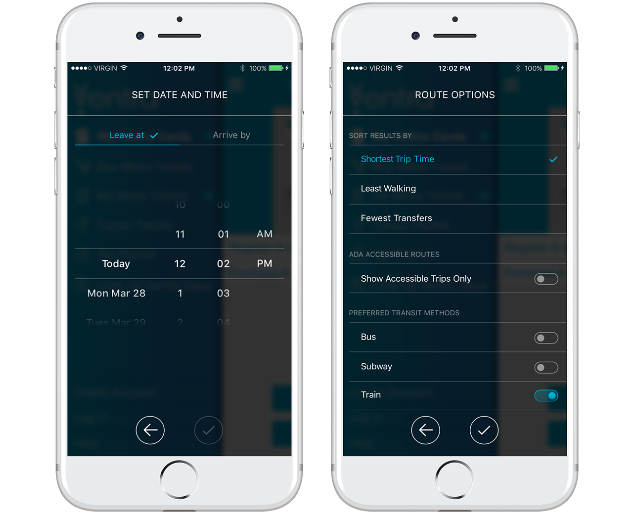
Trip Customizations
By tapping the clock icon, users can plan what time they'd like to start their trip or what time they'd like to arrive at their destination up to 30 days into the future. Tapping the gear icon opens Route Options, where users can customize sorting options and preferred transit methods. Here, users also have the ability filter out route options that don't meet ADA accessibility standards.
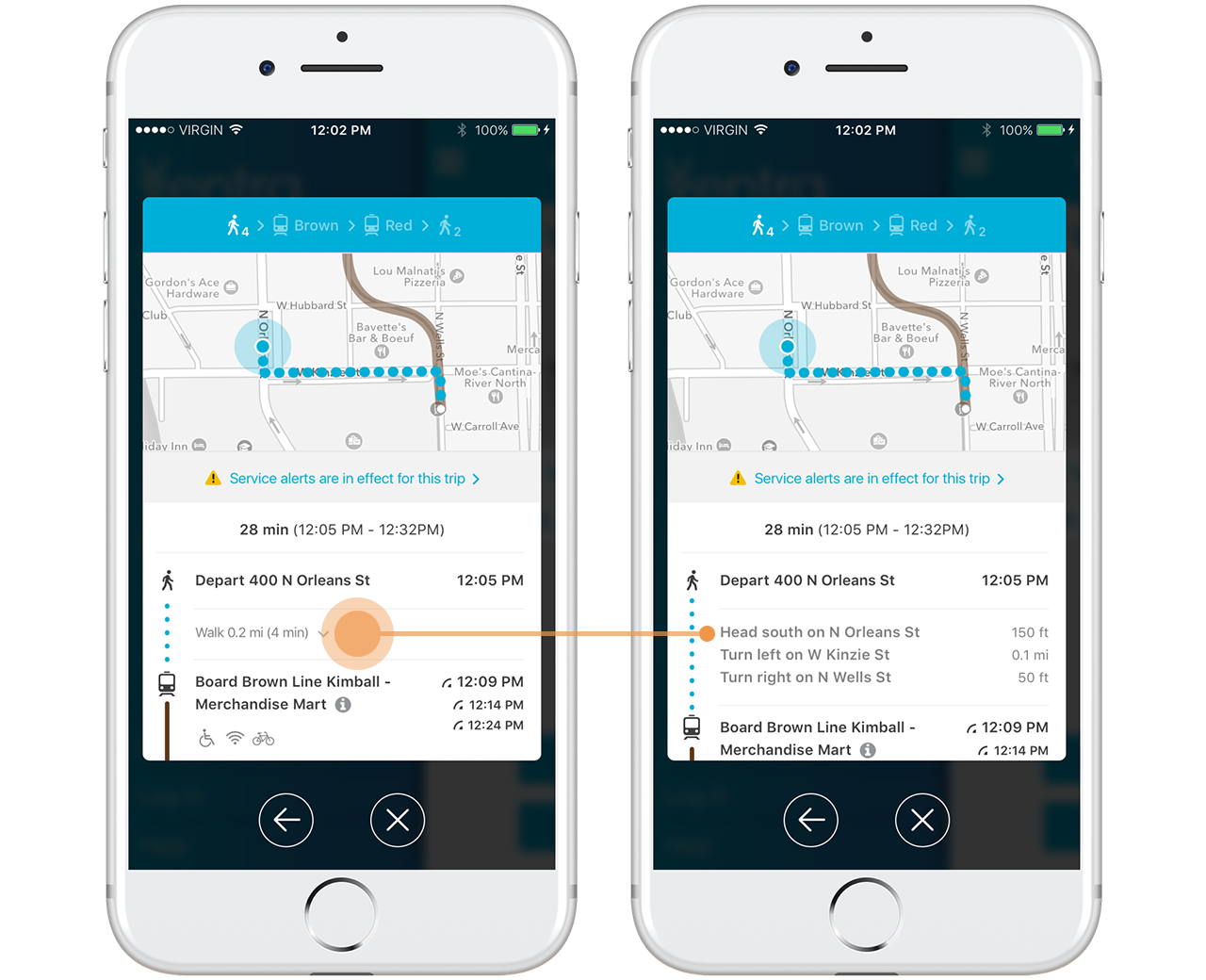
Expanded Results with Turn-by-Turn Directions
Once the user selects a route from the results screen, their selection expands into a detailed list of directions for each leg of their journey. For even more detail, the user can tap their walking distance to drop down turn-by-turn walking directions.
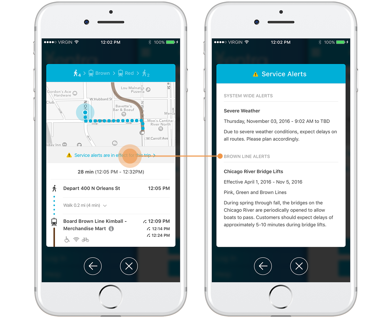
Up to Date Alerts
One challenge we faced was how to alert users of not only line-specific service alerts, but system-wide alerts as well. The yellow alert icon lets the user know there are service alerts for the trip and the banner at the top of the direction list can be tapped to open detailed information about said alerts.
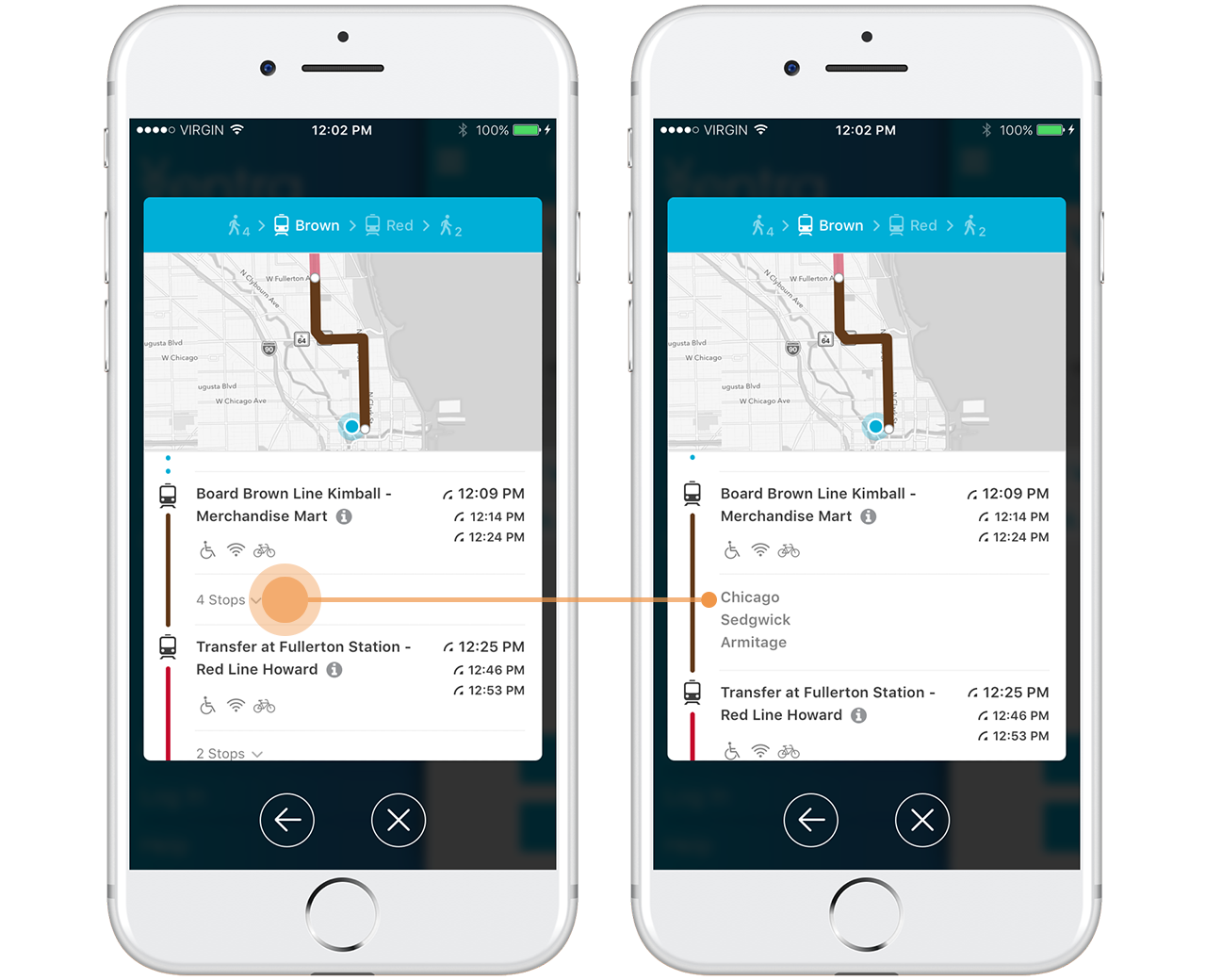
As the user scrolls through their trip directions, the map updates to show the corresponding leg of the trip. Each transit segment includes real-time arrival info and metadata icons to indicate if the train or bus is wheelchair accessible or has wifi or bike racks. Similar to walking directions, the user can tap on the number of stops to drop down a list of station names so they're prepared for their stop.
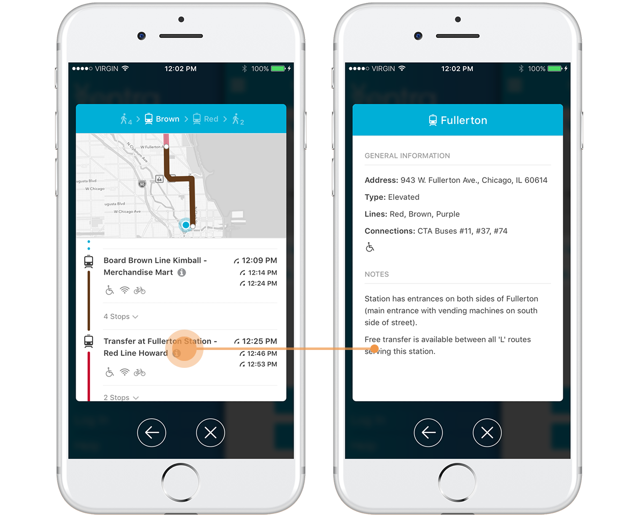
For even more details, the user can tap the station name to bring up a list of station Information.
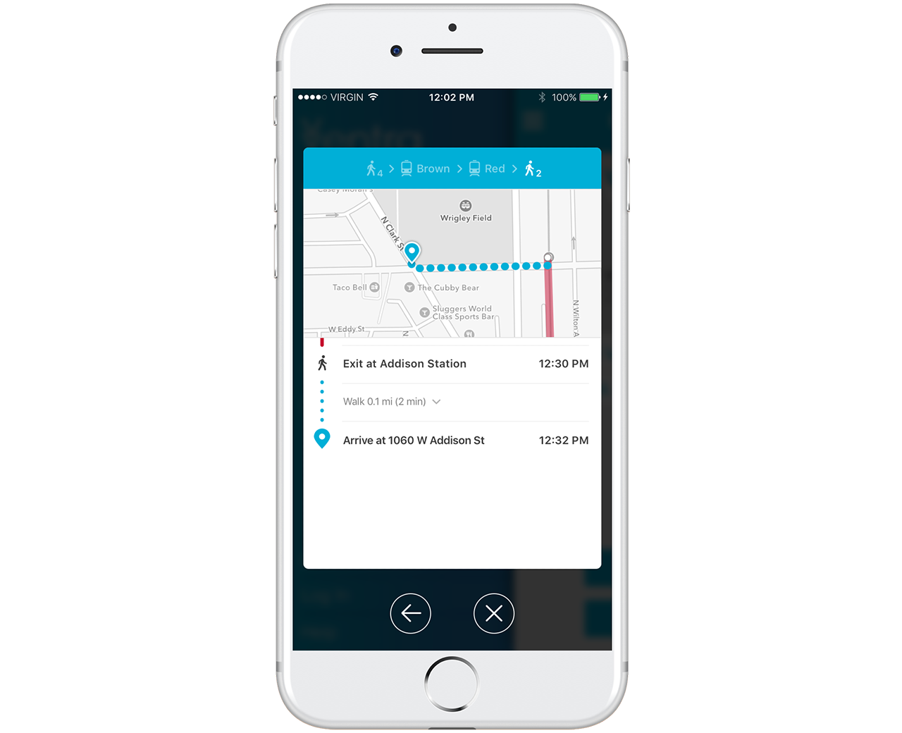
Trip Planner provides detailed walking directions through the end of the user's trip.